Navigating the Wild West of CSS: Tips for Consistent Styling
In the chaotic realm of web development, CSS often feels like the wild west, with a myriad of frameworks, methodologies, and tools vying for your attention. To ensure consistent styling across your projects, it's essential to establish a solid foundation. Start by adopting a naming convention like BEM (Block Element Modifier) which can help you create clear, manageable class names. This practice not only aids in maintaining consistency but also enhances collaboration among teams by making code more readable and intuitive.
Additionally, leveraging CSS pre-processors such as Sass or LESS can provide powerful features like variables, nesting, and mixins, which allow for more scalable and organized stylesheets. Consider organizing your styles in a modular fashion with CSS modules or component-based architecture to further promote consistency. Lastly, frequent testing across devices and using tools like BrowserStack can help you identify and rectify discrepancies, ensuring your site looks polished and professional across all platforms.
The Art of Responsive Design: How to Make Your Site Shine on Any Device
In today's digital landscape, the art of responsive design has become crucial for businesses seeking to provide an exceptional user experience across various devices. By employing fluid grids, flexible images, and CSS media queries, designers can create websites that seamlessly adapt to different screen sizes, from mobile phones to large desktop monitors. This adaptability not only enhances usability but also positively impacts search engine rankings, as search engines prioritize mobile-friendly sites.
To truly make your site shine on any device, consider implementing the following best practices for responsive design:
- Prioritize mobile-first design: Start by designing for the smallest screens first, then scale up to larger devices.
- Use flexible layouts: Grid systems and relative units ensure your design adjusts fluidly.
- Optimize images: Use responsive images that adapt based on the device's screen size to improve loading times.
- Test regularly: Utilize various devices and screen sizes to identify and rectify display issues.
From Concept to Code: The Journey of a Frontend Developer
The journey of a frontend developer begins with a concept, often sparked by creative ideas and user needs. Initially, developers engage in brainstorming sessions, where they outline the core functionalities and design elements required for the project. This phase often involves creating wireframes and mockups using design tools to visualize the user interface (UI) and user experience (UX). These early stages are crucial as they set the groundwork for turning abstract ideas into tangible code.
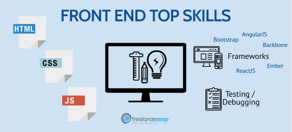
Once the concept is solidified, the frontend developer transitions to the coding phase, where the design is transformed into a functional web application. This process usually involves using technologies like HTML, CSS, and JavaScript to bring the vision to life. Developers rely heavily on frameworks and libraries such as React or Angular to streamline their workflow and enhance the user experience. Testing and iteration follow, ensuring that the final product is not only visually appealing but also responsive and user-friendly.