Understanding the Fundamentals of Responsive Web Design
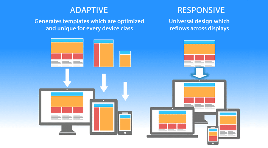
Responsive Web Design (RWD) is a design approach aimed at creating websites that provide an optimal viewing experience across a wide range of devices. This technique enables websites to adapt seamlessly to various screen sizes, from desktop monitors to smartphones. By utilizing flexible grids, fluid images, and media queries, designers can ensure that their content is easily readable and navigable, regardless of the device used. An important key principle of RWD is to prioritize the user experience, as it allows visitors to access information effortlessly, leading to increased engagement and higher conversion rates.
To fully grasp the concept of Responsive Web Design, it is essential to understand its core components:
- Fluid Grids: Unlike fixed layouts, fluid grids use relative units like percentages, allowing elements to resize proportionally based on the screen size.
- Flexible Images: Images in responsive design should also scale within their containing elements, utilizing CSS properties like
max-width: 100%;to ensure they do not overflow their containers. - Media Queries: These CSS techniques enable the application of different styles based on the characteristics of the device, such as its width or resolution, ensuring that the layout adjusts to match the user's environment.
5 Key Benefits of Implementing Responsive Web Design
Implementing responsive web design offers numerous advantages, with the primary benefit being improved user experience across various devices. By ensuring that your website adapts seamlessly to screens of all sizes, from mobile phones to tablets and desktops, you significantly enhance accessibility. Users appreciate the convenience of accessing your content without the need to zoom in or scroll excessively, resulting in lower bounce rates and higher engagement levels.
Furthermore, adopting a responsive web design strategy boosts your site's SEO performance. Search engines like Google prioritize mobile-friendly websites in their search results, meaning that a responsive design can lead to better visibility and higher rankings. Additionally, having a single URL for the desktop and mobile versions of your site simplifies link sharing and social media efforts, ultimately driving more traffic to your content.
How to Optimize Your Site for All Devices: A Step-by-Step Guide
In today's digital landscape, optimizing your site for all devices is crucial for enhancing user experience and improving SEO. Responsive design is the foundation of this process, allowing your website to adapt seamlessly to various screen sizes, whether it's a desktop, tablet, or smartphone. To start, you need to implement a fluid grid layout that uses percentages instead of fixed pixels. This ensures that your website elements resize proportionally based on the user's device. Additionally, consider using media queries in your CSS to apply different styles for different devices, providing an optimal viewing experience for all visitors.
Next, test your website's performance across multiple devices to ensure that it not only looks good but also functions properly. Utilize tools like Google’s Mobile-Friendly Test to identify potential issues that may affect user interaction on mobile devices. You should also optimize your images by using responsive images with the srcset attribute, which allows different image sizes to be served based on the device's resolution. Finally, always prioritize fast loading times, as a slow website can lead to high bounce rates and negatively impact your SEO ranking. By following these steps, you'll create a website that caters to all users, ultimately improving your site's visibility and performance.